Worldwide Ballet Class
The app

A video hosting platform of ballet classes for
the worldwide dance community

How it All Began

WHAT DO DANCERS DO DURING A PANDEMIC?

At the beginning of the pandemic, ballet companies across the world shut down. Professional dancer Diego Cruz and ballet master Ruben Martin started hosting zoom ballet classes for their colleagues, a week into the pandemic.

In a small yet global community the word spread, and soon there were hundreds of people taking class every day. The founders created a name for themselves – Worldwide Ballet Class. They began offering two ballet classes a day, as well as pilates, gyrotonics, and other popular dancers friendly workouts.

THE COMMUNITY GROWS

As the momentum grew, so did the users. Soon there were dance students young and old, showing up every day to take classes. Not only from my research, but from personal experience, there was a huge sense of comfort and community in these classes. It was heartening to see people from all over the world, doing pirouettes in their living rooms.

Process

THE PROBLEM

A year and a half later, most dancers have gone back to work, but people are still taking WWB Classes. The founders are eager to keep their community of 14k followers involved. 

THE CHALLENGE

How can we continue engaging the global community of WWBC?

THE TEAM

The soon to be project manager had an idea for an app to host all the existing and future worldwide ballet classes. The founders loved this idea, so I assembled a small team to prepare for the project.

Diego and Ruben (Founders)  

Steven (Project Manager)  

Emma (Me! The Designer)  

Research

WHAT WE DIDN'T KNOW

The idea for the app was to have a place to host all the past videos of classes, so that dancers could easily search for and find classes. But I needed to answer a few questions:

  • Who would use an app like this?
  • Would people continue to use this, post pandemic?
  • Is the experience of watching class on a phone good enough? 

PEOPLE WHO DANCE FOR FUN

During our kickoff meeting, the founder noted that the most engaged users were people who take ballet for fun, and thought this demographic would be promising over dance professionals, most of whom had gone back to work. Using analytics from the WWBC youtube channel, I was able to gather some data on users to validate this and learn more about the demographics.

Views By Device
Views By Location
Views By Gender

The analytics showed that users did in fact use their cellphones for class, mostly were based in the U.S. and were largely female. Armed with this knowledge I headed into the research.

RESEARCH TAKEAWAYS

Through user interviews and market research I aimed to:

  • Uncover any pain points with taking WWB Classes.
  • Understand user’s feelings about community in the dance world.
  • Find out if an app was a viable solution to keeping this community together.
Pictured: Affinity map of the five user interviews.

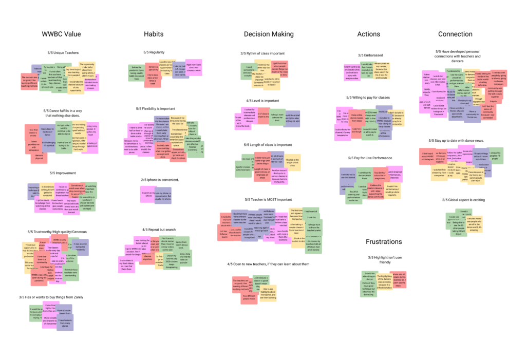
User Interview Insights – Motivations

a. Dancers seek out a personal connection with teachers because they enjoyed having an inside link to the dance world.

“It keeps you up close and personal with the dancers.”


b. A unique opportunity. All the interviewees said that having access to great teachers was what motivated them to keep taking classes.

“The opportunity to take ballet class from amazing artists, I couldn’t miss it.”

UNIQUE MARKET INCREASES ACCESSIBILITY

During market research, I discovered that there is a lack of online dance platforms that offer a variety of ballet. Aside from ballet schools moving online, no one was offering a global online school. Validated through my research was the fact that people who took WWB Classes, were motivated by being able to take class from amazing teachers and dancers that they knew of, but had never had access to before.

User Interview Insights – Class Taking Habits

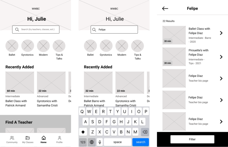
a. Dancers repeat classes multiple times, yet some dancers said they had difficulty finding the specific class they wanted to take.

“It takes a long time to find the video on youtube.”


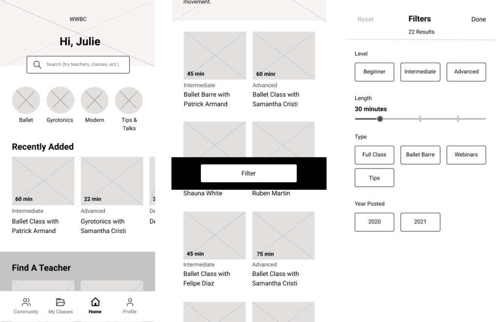
b. Flexibility is important. All dancers said that they took the recorded classes instead of the live classes to fit into their schedule.

“Distractions happen, so I often pause, go back, and check the steps.”

HOW DO USERS APPROACH TAKING CLASSES?

Dancers often saved or tried to save classes because they wanted to take the same class multiple times. They faced difficulty with this.

All interview participants expressed interest in new classes but also preferred to take them after they had been recorded because they wanted to go at their own pace.

THE PROBLEM

How can we make it easier for users to access all past and future classes?

Define

A VIABLE SOLUTION

Knowing that users were frustrated with saving and accessing videos, I knew that we could create a better experience for them in the form of an app, with well designed search and browse features. It needed to be easy for users to find classes that they had already taken, as well as find new classes by their favorite teachers. I went through several iterations of the site map before landing on this one. I initially had a classes page on the navigation bar, but then removed it and kept all the classes on the homepage for simplicity.

Pictured: Final iteration of site map

FINDING THE FLOW

While I knew that community was important to users, after doing a prioritization exercise, I realized I needed to design and test finding and saving classes which was all important for user retention.

Pictured: User flow for onboarding, browsing or searching, and saving a class

Design

KEY MVP DESIGN CONSIDERATIONS

Our target users are women in their 50’s and 60’s. Research showed that they were familiar with social media platforms but were not technologically savvy. To create the best experience for them, I focused on designing:

  1. An easy to use search feature.
  2. An easy to use browse feature.
  3. A straightforward saving option.

1. SEARCH

Across the board, users wanted to find classes by specific teachers. The search bar is at the top of the main page, to allow users to search for the teacher of their choice.

Pictured: Home screen, searching by teacher, search results page.

2. BROWSING - USERS NEED TO SEE...

Level, length, and teacher were the most important decision factors used by people to decide on a class. I initially tried giving them the option to filter by teacher, but realized that there were too many (over 30) different teachers. In testing, people used the search bar to find a specific teacher. For browsing, I gave filter options of level, length, and type of class.

Pictured: Home screen, category screen with filter button, and filter page to select filters.

Pictured: User flow for onboarding, browsing or searching, and saving a class

3. SAVING

Users needed to access classes they like more than once, so I added “my classes” to the navigation bar and allowed users to save a class to a specific playlist.

Pictured: Class page, saving and creating a playlist screens.

Usability Testing

USABILITY TESTING ITERATIONS

I took the users through a series of tasks to test the flow of onboarding, browsing, and searching, and saving a class.

Action: Filtering Classes

I made two copy changes to improve clarity.

  • Filter became filter classes, with an icon.
  • Apply became done.

Action: Saving and Creating A Playlist

Saving the class proved to be a sticky spot for users. I initially used the save icon that youtube has, because I knew all the users were familiar with that platform.

Participants all clicked on the “save” icon but 20% of them had difficulty choosing it. I changed the icon to a save heart which I had originally vetoed because I thought it would be confusing. 

As the participants continued the process, several of them were unsure what the playlist meant and felt lost without instructions.

I changed the title to match the navigation bar tab “My Classes” and provided instructions. I wanted to make sure users added the class to a specific playlist so they would remember where to find it.

Branding

Pictured: Style tile; Palette: energetic and approachable; mood: exciting and friendly.

Final Designs

CELEBRITY TEACHERS

Users across the board were drawn to WWBC because of the teachers. But unlike most other exercise apps, users were initially motivated by teachers or dancers they had heard of.

The teacher bio page serves to provide credentials of the teacher but also provide delightful bits of information that students may have not known before.

Pictured: Teacher bio page and Home screen – find a teacher module.

CREATING A SPACE FOR DANCERS

Each user found a favorite teacher and formed an emotional connection with them. Adding a profile photo is the first step in establishing a presence in the community. While out of the scope of the project, the user profile page would emulate the teacher bio page, with the goal of giving teachers and students a shared identity.

Pictured: Onboarding, adding a photo, and a mockup of a user profile.

ALL ARE WELCOME

Users valued the welcoming aspect that the founders brought to the classes. It made them feel like a part of the insider dance community. I wanted to replicate that as much as possible during their initial interactions with the app. I used friendly language and shared a welcome video from the founders. 

The community tab also lives on the navigation menu. While not built out during this design sprint, we have plans to do so in the future.

Pictured: Welcome screen, and video intro from founders.

PROTOTYPE

To see the whole flow, view the prototype here.

SO WHAT?

The meat and potatoes of this design is the search and save features shown above. But at the heart of the app is the founders’ desire to keep the community alive. We made it easier for users to find and store their favorite classes, so that we could create a place for users to return to. In all aspects of the design, I focused on presenting a welcoming atmosphere.