RESPONSIVE WEB
DESIGN
Branding and web design for Noah Frisch
Design & Woodcraft, an Artisan Woodworker
Project Context
GETTING TO KNOW THE CLIENT
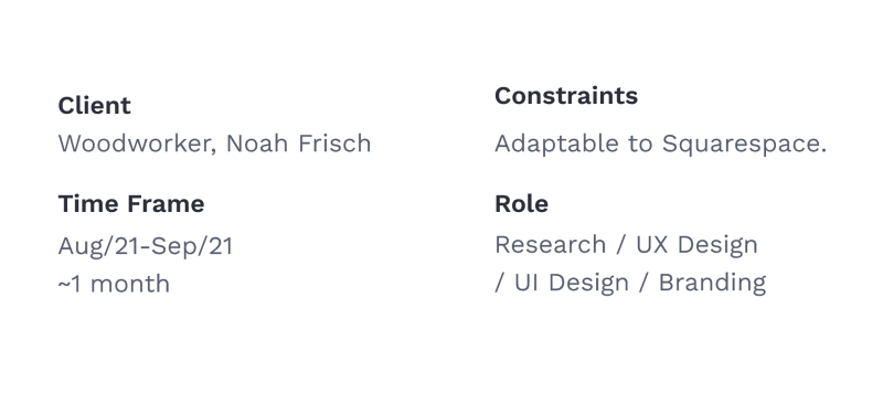
Noah Frisch is a custom woodworker based in the Pacific Northwest, USA. I designed a responsive website for him in order to help potential customers view his work and get in contact with him.
I began the project by learning about who Noah is as a woodworker, and his goals for the business.
Noah focuses on bridging the technical with the aesthetic. He values UNIQUENESS and most importantly he believes in telling the story of the wood.
Process
UNDERSTANDING THE BUSINESS CHALLENGE
Noah needs a way for potential customers to help make the decision to hire him.
How can we promote Noah’s unique skill as a woodworker to increase his job opportunities?
STEPS IN THE PROCESS
Taking a User Centered Design approach, I investigated the job of getting a piece of custom woodwork. Then I designed solutions based on my findings. I conducted usability tests with mid-fidelity mockups and then developed a high-fidelity prototype based on the findings.

Research
USER INTERVIEWS
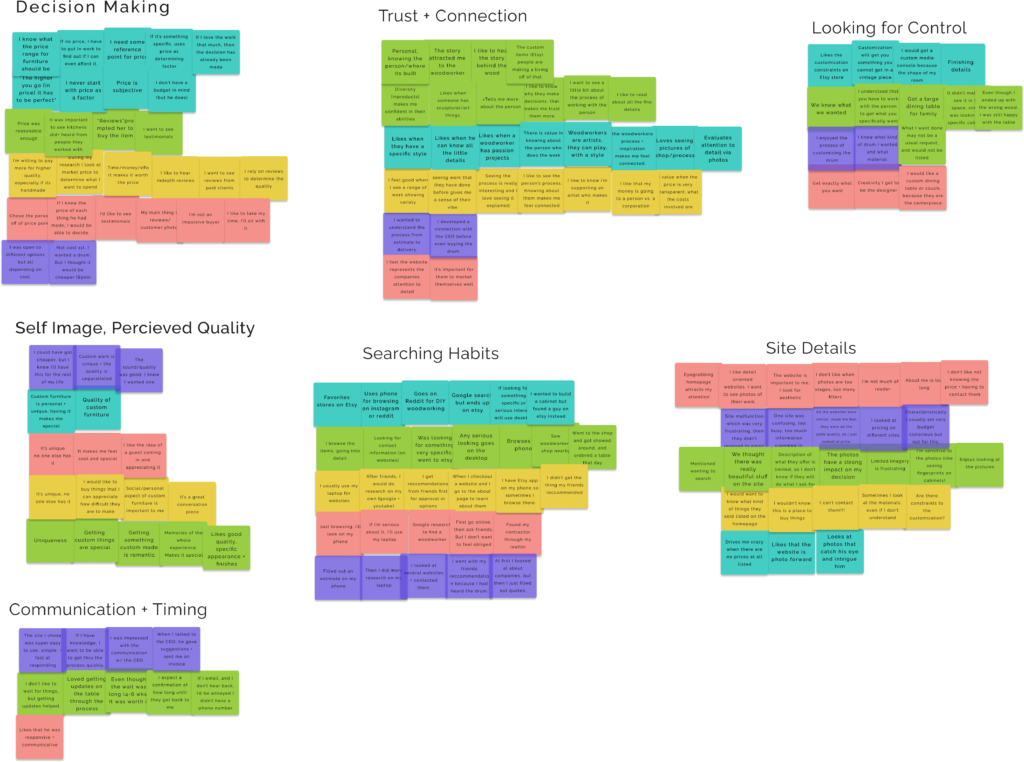
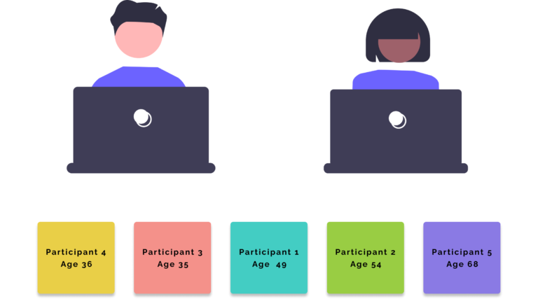
My research focused on discover customer’s decision process of choosing a woodworker. I interviewed 5 people who had gotten custom woodwork made before.
WHY CUSTOM WOODWORK?
Customers were drawn to custom woodwork for the quality, the enjoyable process, and the one-of-a-kind results.
JUST LIKE GETTING A TATTOO
For customers, the woodworker’s aesthetic and personality has to be the right fit. The process for choosing a woodworker reminds me of finding a tattoo artist; the customer assesses the style and quality harmoniously to make a decision.
User Interview Findings
a. Connecting with the woodworker’s story was an important factor in the decision process.
![]()
“The story attracted me to the woodworker.”
b. It isn’t just about the product. People enjoyed getting to know/working with the person making their item.
![]()
“Memories of the whole experience, Makes it special.”
THE CHALLENGE
HOW CAN WE BEST PRESENT NOAH TO BUILD USER CONFIDENCE?
Define
CREATING A USER PERSONA
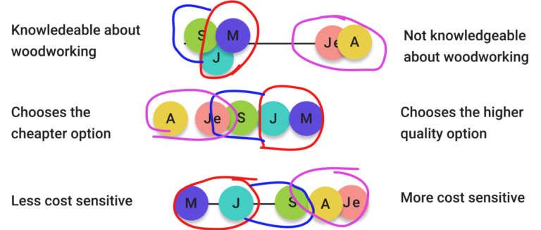
After understanding user needs, I spent some time creating variability scales to determine the difference between customers in their decision making process.
MEET JESSIE (USER PERSONA)
Using the interview data I created Jessie to be the voice of a potential customer and to guide the design phase.
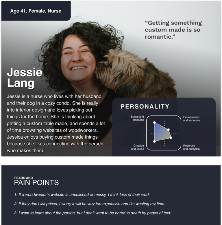
USER INSIGHTS BECOME OPPORTUNITIES
I went through the key decision making points and thought of how they could become opportunities to showcase Noah in a way that would be most appealing to customers.
Point Of View Statements
a. Jessie needs to know that Noah Frisch is a good person to work with and is trustworthy.
![]() How might we earn Jessica’s trust with NF Design + Woodcraft’s website?.
How might we earn Jessica’s trust with NF Design + Woodcraft’s website?.
b. Jessie wants to know that Noah Frisch will be communicative and responsive to her needs.
![]() How might we portray Noah as responsive and communicative?
How might we portray Noah as responsive and communicative?
Design
SITE BROWSING MEDLEY
In my interviews, participants browsed the site in a manner of ways. It goes without saying, my main goal was to ensure the user could navigate freely to each area without any obstacles. The site needed to have many roads leading to the same place.
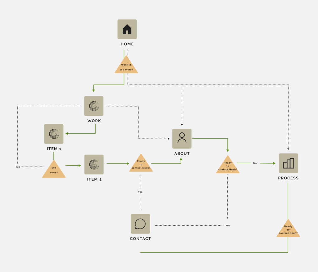
THE WHOLE USER EXPERIENCE
For customers, a lot of the JTBD happens outside of the website.
As the designer my goal was to make Jessie as confident as possible about what would happen after her experience with the project by:
- Providing an ample biography section
- Give Jessie multiple avenues to contact Noah, and indicators of what to expect.
- Show a variety of Noah’s work with broken up content and many polished photos.
Usability Testing
TESTING & ITERATIONS
All Participants were taken through 6 tasks focused on decision making and terminology using the mid-fidelity figma prototype.
Measuring User Confidence
Out of 6 tasks, only 1 had a less than 100% success rate.
For my iterations, I focused on improving terminology and making information more findable with the goal of increasing user confidence in the decision process.
Scenario 1
You are interested in hiring a woodworker to make a custom piece of furniture, you decide to check out Noah Frisch, a local woodworker, on his site.
Scenario 2
You are on the site – what would you do if you wanted to…(I then asked about various areas of the site)
Action: Homepage Scrolling
Users saw the testimonials but either quickly forgot about them, or didn’t realize there were several to look at.
Before
After
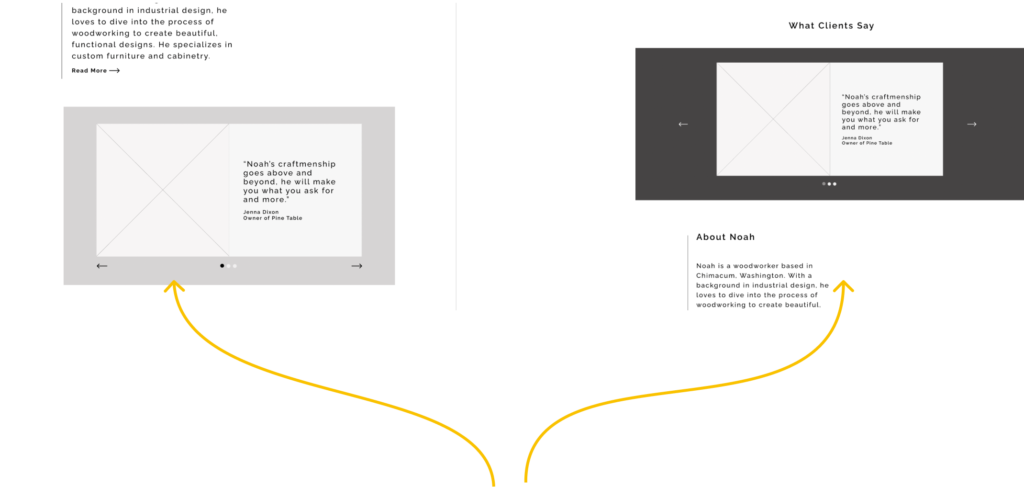
I added a heading to the testimonials, moved it further up the page, and created more contrast between the background and the testimonials, to draw users’ attention to it.
Action: Homepage Scrolling
4 out of 5 participants did not scroll through the homepage in task 1, because they did not think to, or did not realize it was there.
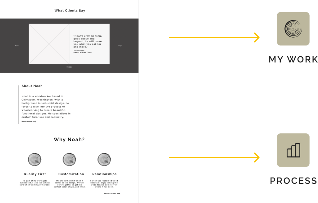
- I added individual testimonials to the related product page because users said this was where they expected to see the testimonials.
- I added the value proposition to the process page for the same reason.
By adding these blocks of information to other pages I wanted to ensure users would see this information if they didn’t scroll through the home page.
Branding
LET'S STYLE THE STORY
Noah’s work is all about telling a story with the wood. His defining keywords are; Approachable, high-quality, and functional.
I used earthy tones for the color pallete, to embody this idea, and to complement the photography. For typography I used Quicksand, a friendly rounded font and paired it with Raleway for a touch of sophistication.
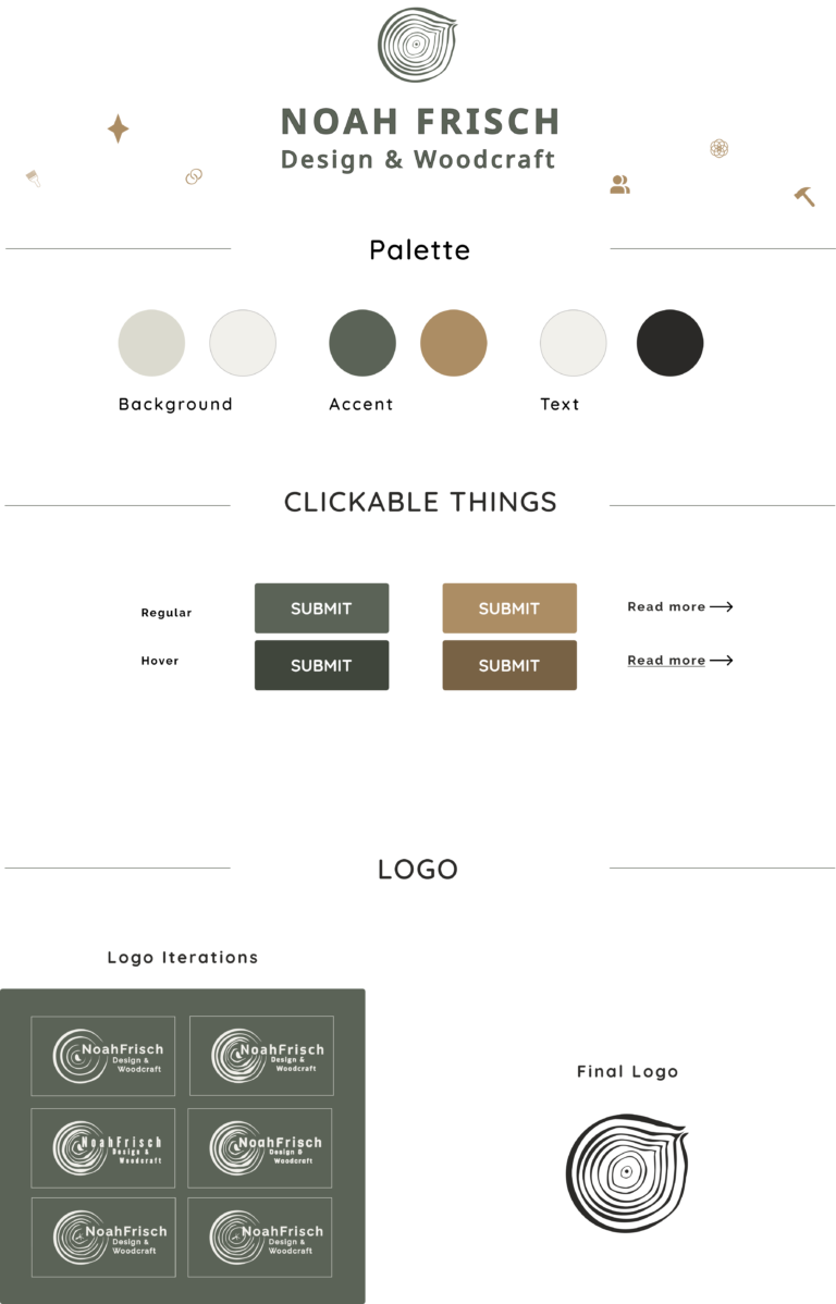
Final Designs
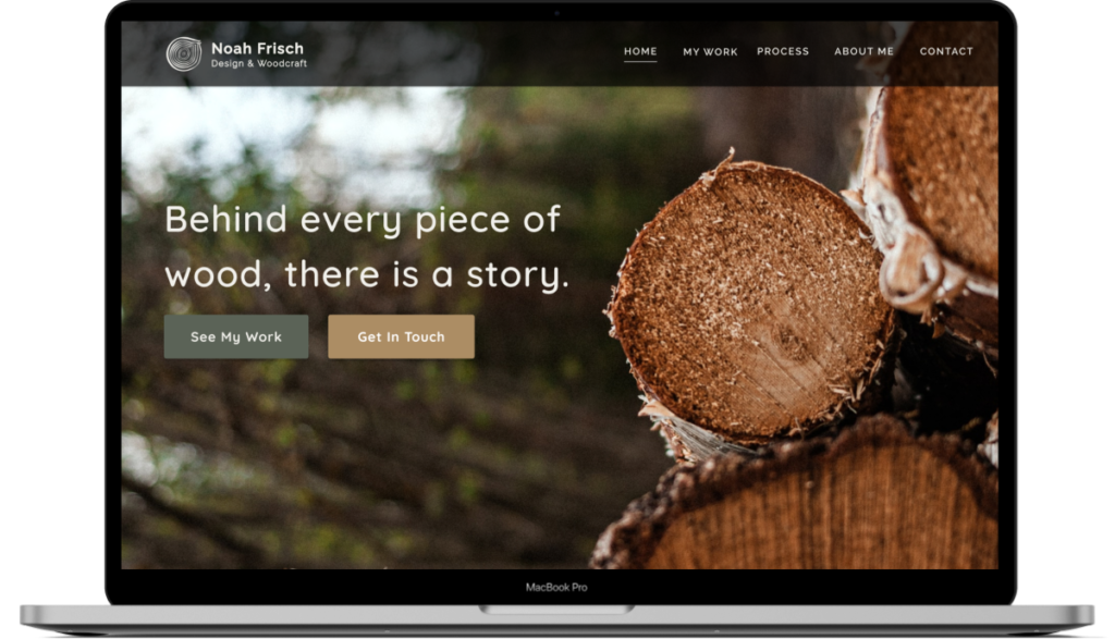
THE HOMEPAGE
The homepage is key for a small business. Potential customers must be drawn in immediately and want to know more. In our very first meeting, the client talked about each piece of wood and how it tells a story. I could tell how much he cared about his craft from this idea of story telling. The homepage is meant to both intrigue the viewer and give them a sense of Noah as a woodworker.
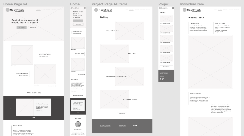
Pictured: Homepage mockup, desktop version.
INDIVIDUAL ITEM PAGE
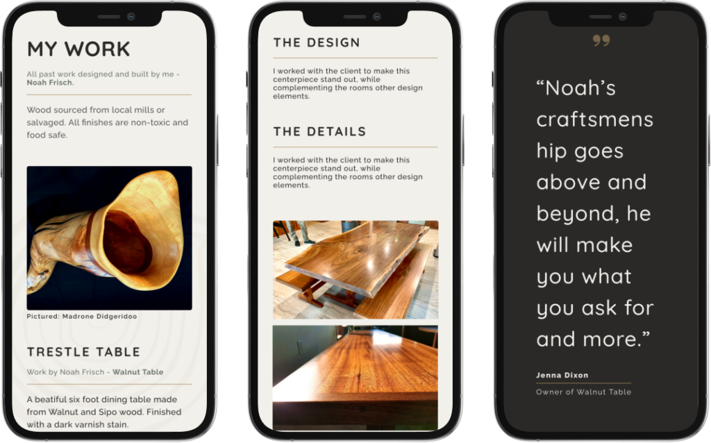
Potential customers either wanted to read every little detail, or simply look at photos and pricing. But either way, they needed to trust Noah’s abilities with wood. I made the layout of this page conducive to both. It also includes a personal review from the owner of the item.
Pictured: Work page and individual item page, mobile version.
PROCESS PAGE P.1
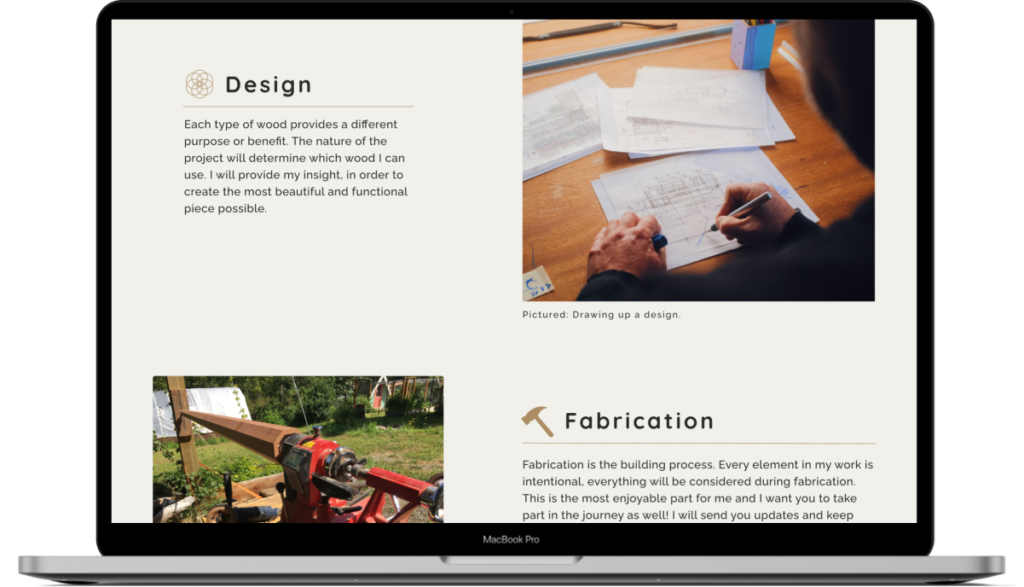
For the woodworking experts, I needed a page to explain Noah’s process in great detail. Using Noah himself as the knoweldge expert I created sections to break up the content and icons to match. The page can easily be understood by a quick scroll for those who don’t want to read the details.
Pictured: Woodworkers process page, desktop version.
PROCESS P.2
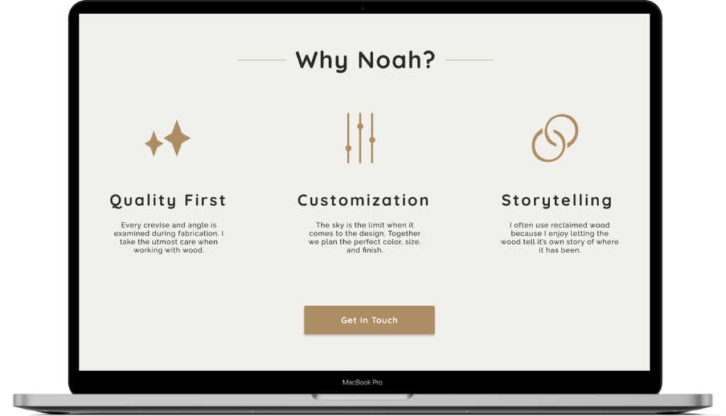
Woodworking is unique because customers are buying something they haven’t seen yet. Therefore, the main goal of the website is to instill trust in Noah’s work. Here I created a value proposition that shows what set’s Noah apart from other woodworkers. proposition that explains
Pictured: Value proposition on process page, desktop version.
BRINGING IT ALL TOGETHER
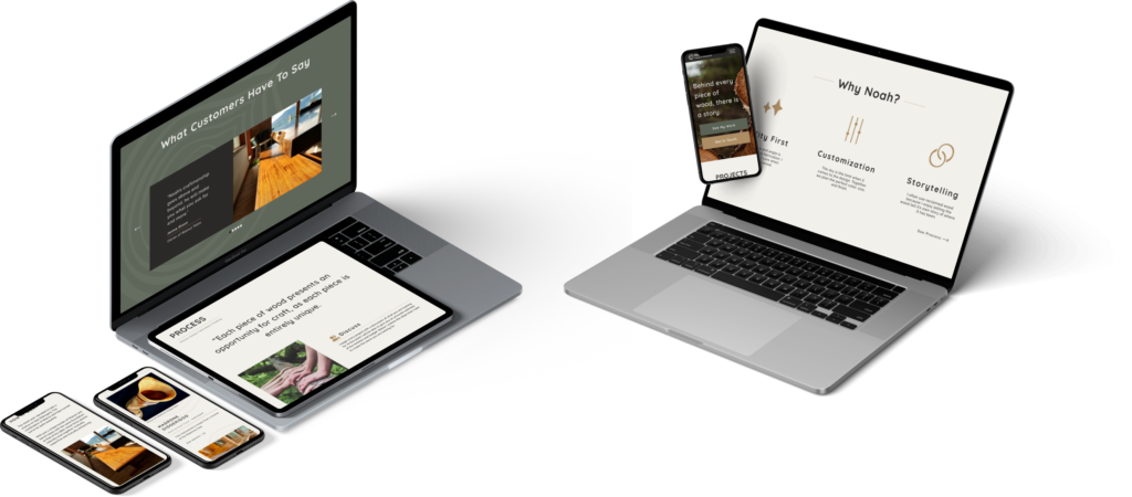
Because of the intimacy of a small business, the website needed to reflect Noah and his business wholeheartedly. When I presented the website to the client, he was overjoyed with the results. The goal – A beautiful website that tells a story and makes the potential customer confident in choosing Noah to create their custom piece of furniture.
NEXT STEPS AND CHALLENGES
A responsive website is something every designer knows. However after talking through this project with a developer I now have a better understanding of how to execute this design. My next step is to implement this design in WordPress for the client.