New Referral Experience

A new and improved referral experience for the Unite Us platform.

Background

This initiative was designed for the Unite Us platform, a company on a mission to improve the lives of people facing critical social challenges—such as food insecurity, homelessness, mental health issues, and more. At the heart of the platform is a closed-loop referral system that sends and tracks referrals, connecting people to resources in their communities.

Understanding the problem

Our referral sending experience was clunky and difficult to use.

  • Users had to switch between pages to find the right resources for their clients.
  • Each new referral required taxing data entry and lacked error prevention.

Goal

Improve the referral experience and reduce the time it takes to send a referral.

My role

As design lead I was asked to redesign the referral process to make it easier to use while increasing functionality to account for more user workflows.

Team
3 Product Managers
2 Product Designers
1 UX Researcher
4 Engineering Teams

Constraints

The platform has complex backend logic for sending and receiving referrals that includes ways of protecting clients when the resources involve sensitive topics like domestic violence and mental health. We were asked to not make any changes to this logic.

*Note that due to privacy policies I cannot share the designs for this project.

The Impact

More efficient workflows

We reduced the number of clicks by 37%.

We made it easier for users to find the right resources for clients and reduced the median time to complete a referral from 3 minutes to 1 minute.

Increased functionality

We integrated the ability to share resources directly with clients into the referral workflow. In the new experience, users can refer, share resources, or do both. Integrating the share feature helped increase connections to care. In the month of September 2024 over 500,000 resources shared to clients across the country.

Research

Multiphased process

For this project I paired with our lead researcher and conducted multiple research studies to validate the designs throughout the process.

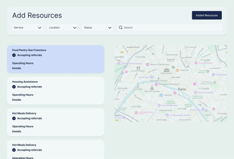
What users have to say

a. Users appreciate the reduced number of clicks.

I love it because it’s, you know, I say every second counts, every extra click matters. And if we have someone who is looking for, for rent, utility or rent and emergency food and a food pantry like that is three clicks. We could do in three clicks versus 15 clicks.

b. Users also liked being able to search by multiple service types at the same time, which saves time and effort time and effort.

To be able to click more than one or kind of click in and out. I think, you know, to search by multiple things at the same time, but not all three would be helpful.”

The Solution

Free search experience

After many iterations, we created a search experience inspired by shopping platforms where the user can search for multiple resource types at once, view details and add them to their “cart”. From there they are given the chose to either create referrals, or share resources, splitting the workflow off depending on the user need.

Complex referral logic made simple

Once the user decides to create referrals they arrive on the referral preparer page, where referrals are grouped according to our complex logic. Users can choose to edit the groups but are given guardrails and guidance to prevent them from grouping then incorrectly.

*example mock of the search page and referral preparer experience.

Final Remarks

The “New Experience” officially launched for all customers in May, 2025. Read more about it here.

Want to learn more about other work I’ve done at Unite Us?