Goal Setting
For Learners

A long term goal setting feature for Coursera, the online learning platform.

Project Context

Company: Coursera

THE ONLINE EXPERIENCE

Coursera is a popular online learning platform that has over 70 million users worldwide. Online learning has been growing in popularity (especially since the pandemic), yet there are many difficulties that online learners face. As a lifetime online learner and designer, I am always thinking about ways that online learning could be improved. I began this project by talking to learners to discover an opportunity for Coursera to make a difference in online learning.

*Note: this was an academic project, I am not affiliated with Coursera.

Process

WHAT I DIDN'T KNOW

I have taken a lot of online courses, but i’ve never used Coursera. So, I went in with an open mind, ready to uncover any and everything. I really didn’t know what issues Coursera users faced or who they were. I also wanted to design an app feature, but I didn’t know if people actually used the app for learning or not. 

Taking a User Centered Design approach, I began talking to learners to see what frustrated them about Coursera the most; I knew there would be something.

Research

Pictured: Steps in the design process for adding a feature.

TARGET PARTICIPANTS

Coursera makes a big deal about it’s ability to help people change careers, or improve skills at their current job. I decided to talk to learners who were taking a course related to career benefits, because I knew from a business perspective, these participants would be important.

Pictured: *Data collected from the 2020 Coursera Consumer Impact Report

RESEARCH iS HARD BUT REWARDING

I interviewed 5 participants from around the world to inform my feature decision. Let me just say, that I learned so much from them. Finding out that a software engineer in Kenya, and a UX Researcher in the U.S. feel the same way about goal setting was pretty cool. 

Pictured: The five research participants

The first thing I realized was that learners preferred learning on a computer due to the larger screen size and the avoidance of distractions that occurred on the mobile app. Therefore I realized it would be most beneficial to add a desktop feature rather than an app feature.

Coursera currently has far fewer features than the desktop, after doing my research, I understood why.

User Interview Insights

a. Flexibility in deadlines was something that learners wanted, to avoid the frustration of having to reset the deadlines.

“The goals & deadlines make me feel like i’m in a race.”


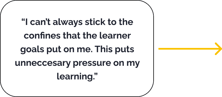
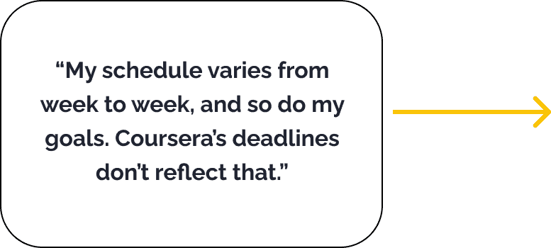
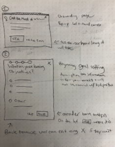
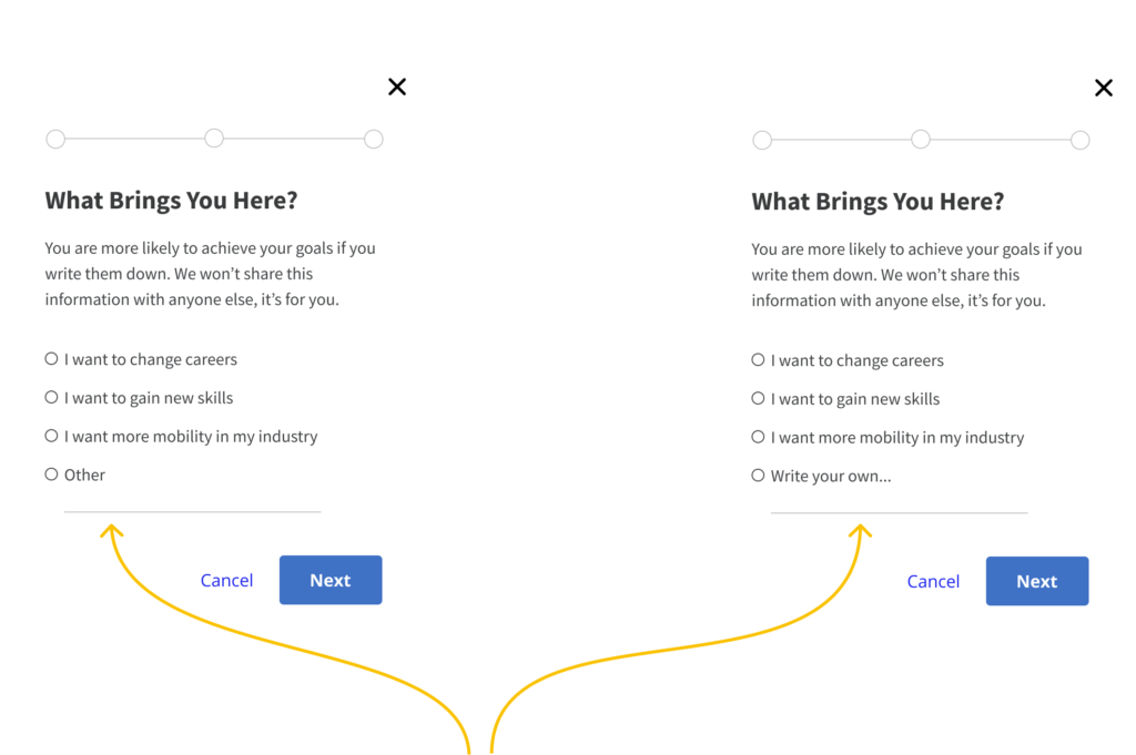
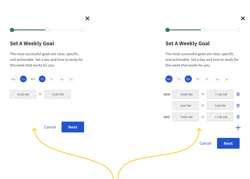
b. Personalization and customization are key. Learners didn’t feel like the goals always matched their goals, or their schedules.

“I would like to be able to set my own goals, not just what they want me to get out of it.”

PICKING THE RIGHT PROBLEM

After gathering insights from my interviewees, I did a secondary round of research to see if I could validate the learner problems and flesh out areas of improvement.
I explored several problem areas but I ultimately put my efforts into goals and scheduling because it was the only area that wasn’t already being outsourced by learners. For instance the forums in Coursera need improvement but many learners either had no interest in using them, or just went to linkedin and other platforms where interactions were more fluid and generous. 

Research findings from a book on the principles of learning states that: Students may be hindered by unrealistic goals. When faced with pressure that feels unreasonable they may lose motivation. Goals vary greatly from learner to learner depending on their specific motivations.

Several research studies on learning and goal setting provide some insight into this problem. Firstly, goals must be clear, specific, and achievable. The current Coursera goal design does not allow users to achieve weekly goals if their schedule varies from week to week. Furthermore, a research backed book on the principles of learning suggest that students have a huge variety of goals for learning that go beyond what the teacher or school thinks of as goals. For instance a goal could be work-avoidance, a.k.a trying to do the work as quickly as possible.

*Reference: https://firstliteracy.org/wp-content/uploads/2015/07/How-Learning-Works.pdf

THE CHALLENGE

How can we help users stay motivated?

Define

DESIGNING FOR REAL LIFE

Coursera learners take courses because they want to learn something. They each have a unique goal and we know that most, have a desire to finish the course.

But….life happens.

When learners didn’t follow the Coursera schedule, they were forced to “reset deadlines” Learners felt bad that they couldn’t stick to the prescribed schedule even though there is no penalty involved in resetting deadlines.

A GOOD OL' BRAINSTORM

In order to define what a solution would look like, I conducted a brainstorm session with six other designers.

Then, using my persona Anwar I put the potential ideas on a journey map to see how each one could help learners throughout their learning process.

Pictured: User Journey; pain points, and opportunities.

FITTING THE PIECES TOGETHER

Once I did a prioritization to decide what the feature would consist of, I began pondering these questions.

  • How can I integrate this feature into onboarding along with the current schedule setting?
  • How can I keep the format of the current schedule setting while enhancing it overall?
Pictured: Site map showing where the new feature would be integrated.

Design

SO, WHAT IS IT?

The solution I designed allows learners to set a personal goal for the course, to motivate them in the long term. Then it allows learners to set a schedule that integrates with the submission deadlines. They can change the schedule week by week, according to their schedule.  Lastly it provides a visual tracker of both the learning schedule and the estimated completion date.

The design for the submission deadlines was outside the scope of the user flow but I knew that it would be a part of the improvements for the user. The course assignment due dates will update based on the learning schedule and would eliminate the RESET DEADLINES task that learners find so frustrating.

AND WHAT DOES IT LOOK LIKE?

With the feature defined, I dove into sketching. I went through several iterations of sketching to find the right path. 

Initially I wanted the users to be able to select a goal completion date, but after drawing it out I realized it was better for learners to focus on solidly attainable goals such as scheduling.

Pictured: Sketches of goal setting

SKETCHING TO HIGH-FIDELITY

After sketching, I went straight into high-fidelity knowing that I wouldn’t be making any significant UI changes. Coursera has a pop-ups appear in the bottom left-hand corner, which is where I added my learning personalization feature. By keeping all the modules in the same place, I wanted to avoid disrupting the regular flow for users.

Usability Testing

DETERMINING MENTAL MODES

The biggest user complaint related to coursework, was that users need flexibility from week to week.

For usability testing, I had the learners answer a personal goal question and set a schedule. Then they would go back and edit the schedule afterwards. I wanted to find out if users found the scheduling flexible enough for their needs.

Therefore the test involved two tasks:

Pictured: Task flows of setting a personal goal and weekly schedule.
Pictured: Task flow of adjusting the weekly schedule as needed.

USABILITY TESTING ITERATIONS

During testing, I discovered some difficulties in the learnability of the dashboard. Additionally, users weren’t fully satisfied with the flexibility I provided.

For my iterations I improved visual clarity and increasing flexibility in scheduling.


Action: Selecting A Personal Goal

Learners struggled to fit their personal goal into one of the prewritten categories, even when I specifically tasked them with a goal that was not listed in the section.

Learners wanted to be able to select multiple goals, but were hesitant to select other. I changed the copy to say “Write you own” to create clarity and make the option more appealing. (learners felt that other was a “bad” choice”) However, overall, learners were excited about having their personal goal shown on the final dashboard. They also made the destinction between the long term and short term goals that I was hoping for.

Action: Updating Schedule

Users wanted to  be able to set their learning schedule for different times on different days and multiple slots/day.

I learned from research that people wanted flexibility from week to week, but that they usually studied at a specific time of day. However, in usability testing, people wanted the ability to set different time slots each day. In my iteration, I designed the schedule with more flexibility than it had originally.

If however, someone wants to study at the same time each day, the format causes slightly more work for them. To remedy this, when users select new days, the time box will autofill to the FIRST time selected for the previous day.

COMMUNICATIVE DASHBOARD

After completing the goal and schedule setting, I had learners explain what they understood from the dashboard. Learners were confused by the shaded Monday. They did not understand that it meant the day had already passed.

Users were also confused by the overall progress in relation to the weekly goals.

I eliminated the shaded out day since it was confusing.

I changed the progress to hours instead of percentages to help show the relationship between the progress bar and the weekly goals.

Final Designs

MAKING IT PERSONAL

My research showed that Coursera learners felt a lack of personalization. With any learning platform as big as Coursera, there is a lack of personalization that’s expected, but it leaves users feeling apathetic. The personal goal question I created is written down by users and remains on the dashboard to remind learners why they began learning in the first place.

Pictured: Written in personal goal, and goal displayed on dashboard.

COMMUNICATIVE SCHEDULING

Coursera currently has a learning reminder feature which allows users to set a time to learn, but doesn’t offer a confirmation screen or give any indicators that you have saved your learning schedule. The version I created allows for more flexibility and communicates along the way. It also allows the user to edit at the confirmation screen.

Pictured: Setting and saving a learning schedule.

WITHIN THE BRAND

Resisting my constant desire to fill every page I design with color, I remained true to Coursera’s blue and white scheme. The branding does take a few liberties here and there, for instance after users complete a test they get a celebratory yellow trophy.

Research showed that users wanted visual satisfaction when it came to accomplishments, so I created the congratulations notification with the enlarged personal goal icon, as an ode to the user’s progress in their long term goal.

Pictured: The student dashboard

THE PROTOTYPE

Here is the first flow of onboarding. For the full experience, click view prototype below!

Additional Considerations

THE GOOGLE CALENDAR DILEMMA

A question that came up in the design process was, how can we help users avoid having to delete previously scheduled homework sessions? When learners go in to change their schedule, which inevitably happens, their old schedule still remains in their google calendar. Frustrating, right? While out of the scope of this project, I would like to find a solution that doesn’t involve the user going through and deleting events in their calendar. 

Pictured: Add to calendar option

FEEDBACK FOR METRICS

If I had had more time, I would design a feedback quiz for goal setting. This option would allow users to reflect on the successfulness of the course to help them accomplish their personal goal, and also give Coursera metrics on success.